Tom "CK" Forsey
this tutorial is meant for advanced Photoshop users. If you're unfamiliar with Photoshop's interface, own an earlier version of Photoshop (This doesn't automatically discount you, but the tutorial was written for Photoshop 7.0.), or are new to CGing, I'd suggest you save this for some other time. As with Mie's Sonic Team CG tutorial, and my Sonic Battle tutorial, make bestest friends with the Polygonal Lasso tool. Take it out to dinner. Buy it a present. Get it some flowers. Just make sure it likes you and you know how to use it well.
Right, first off, sketch out your drawing, and then scan it into your computer. On personal preference, just like my Sonic Battle tutorial, I go for Greyscale, at 300DPI. This normally gets rid of unwanted smudges and guidelines. Again, much like my Battle tutorial, it doesn't matter so much about tidyness, as you're going to be inking it in Photoshop, anyway.
Once the image has been scanned, rotate it, or do whatever you need to to make it easy to tell your inkable lines from your unwanted lines. Before we do anything else, we need to convert the image to RGB colour. So go to "Image > Mode > RGB colour." Next up, we'll recolour the lineart for tracing purposes. Go to "Image > Adjust > Hue/Saturation." A dialogue box will appear.
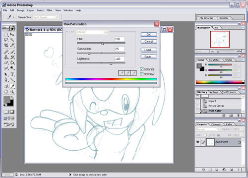
In the bottom right hand corner, click "Colorize." This'll make the lineart a yummy poo brown colour. We don't want that, so what we do is adjust the colour. Drag the Hue slider to about 190 - 200 (anything will do) to turn the image Blue, then drag the lightness slider to about +40. This will lighten up the lineart, so it's easier to tell where your black lines will go, plus get rid of even more stray guidelines, if any. Nifty. Click OK, and your lineart is now ready to ink! You should have something looking like this:
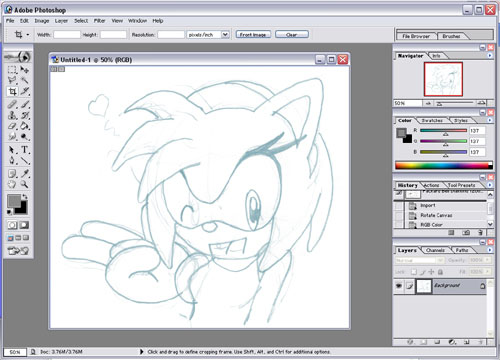
This is a pose of Amy I've cooked up for a contest I've entered, so I figured I'd kill two birds with one stone and do the tutorial at the same time. Mwah. Anyway, create a new layer on top of the lineart. This is the layer you ink on. Obviously, if you want to, you can just skip the inking process and just use something you inked by hand - thing is, the Sonic Adventure style is based upon digital inking, and thusly, will look so much more official, clean, and overall more kickass if you do it this way. As with all CGing, it would also be a good idea to have a reference pic handy.
Note for the faint of heart - this takes a while. If you're expecting this to be a quick 20 minute long job, leave now. Most people make the assumption that the Sonic Team/Sonic Battle styles are fairly simple. They are quite the opposite. It takes a fair amount of time and effort. Depending on size and detail, pics can take up to 2-3 hours just to INK.
Anyhoo, with references in tow, you can begin to ink the drawing. Using the polygonal lasso, and taking it one step at a time, begin to trace over your lines.
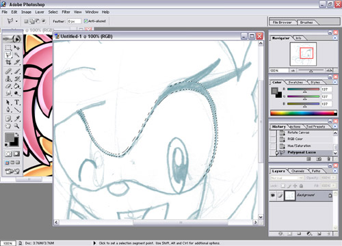
With your lasso, you should get something selected like that. Now, compared to the Sonic Battle style, inking in the Adventure style is Hell personified.* You have to take absolute care to A, keep the lines around the same width apart, and B, keep your curves smooth and avoid ANY kind of jaggedness - Adventure style art has very few harsh corners. An EXTREMELY helpful tip to bear in mind when you're inking is when you've made a selection, go to "Select > Modify > Smooth." Adjust the selection to about 5 - 10 pixels (it's worth experimenting, but try to use a small pixel range for smaller areas), and it'll smooth it off for you. 90% of the time, it produces a great result. Don't rely on it too much though - the only way it'll work well is if the lines are relatively curved to begin with. You can also use "Select > Modify > Expand/Contract" if you've selected too much or too little, without having to reselect the whole thing.
Anyhoo, once the selections have been made, fill it in using the PaintBrush or Fill tool.
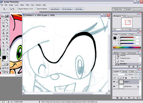
OK, with the Adventure style, what you need to take into account is the varying thickness of the lines. The Sonic Team style doesn't seem to have all that much consistancy to it's lineart, though a pretty safe assumption, from what I've noticed, is to concentrate mainly on thicker lines on the outside of the picture, and thinner lines on the inside. There are also times when one side of a line is thicker than another. This is where a reference comes in EXTREMELY handy. A good idea is to study the lineart of a few official pics, and get a feel for the varying line thickness and where they occur.
::Two hours, episode 3 of Sonic X, and some alterations later...::
Once you're done, delete your original sketch layer, and you'll end up with something that looks a little like this:
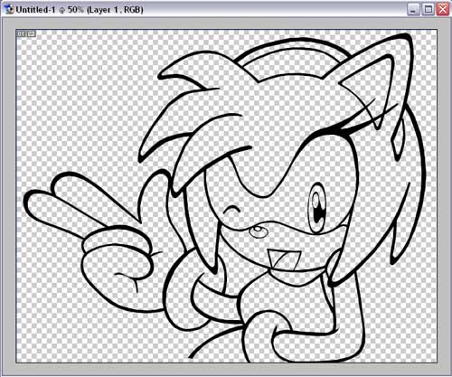
Right then, now you've reached the fun part! Colouring it in!** Save your lineart (the last thing you want is for all of your work to go to waste because of a "coincidental" crash or something), then lock the layer's transparency. To do this, click the polkadot icon just above the layer thumbnails.
Again, it would be a good idea to grab some reference pics. A great way of cheating when it comes to colour (especially on official Sonic characters) is to use the eyedropper to pick up the colours used by the official artists. My eyedropper is obviously going to be picking up colours from an official pic of Amy. So I'm cheating. Of course you'll have your own idea of colour scheme with your own characters.
So. Start off by grabbing your first colour. By personal preference, I ALWAYS create a new layer for each colour I use. That way, there is room for error, and you aren't likely to screw up a drawing completely if you cock up while painting on a single layer. Of course you can use a method you're comfortable with. Create a new layer underneath your lineart, then select the areas you want with the Magic Wand tool (you can select more than one area by holding down the shift key). In the most case, this won't select everything. So, go to "Select > Modify > Expand" and expand your selection by 1 or 2 pixels. This makes the selection seep into the lineart, meaning you don't miss anything. Then fill in the areas with the Paint Bucket.
Now as said, I use a new layer for each colour. To use this effectively, you have to think 3D. Basically put the layers in an order that goes from top to bottom. For example, Amy's hairband is above her pink spikes, therefore create the hairband layer above her spikes layer. Amy's dress is underneath her skin layer *...stared at*, so create the dress layer under the skin layer, and so forth. As a rule of thumb, always put white layers at the very top. That way, they aren't prone to getting "dirty" if another colour happens to seep into them.
Anyway, repeat the colouring process until your base colours are down. You also need to note the nose is not a true black; it's a dark grey, and an even darker grey shading. The Sonic Team style very rarely has true black as a colour. Open up a piece of Shadow art, for example. You'll notice that even though he is meant to be black, the art style contains a VERY dark grey. Anyways, you'll end up with something like this:
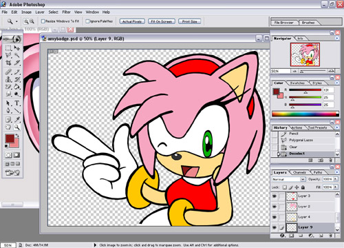
Hoorah.
Right, now we come to the complex part of the shading. First up, select the Paintbrush tool, and then click the large Paintbrush in the top left corner. Select the preset "Airbrush Soft Round 50% Flow." You'll notice the settings change. Now, make sure Opacity is set to 25%, Flow is set to 25% and the airbrush button is on. You won't have to change these settings again. If you need to do any solid linework, either use the pencil, or the Polygonal Lasso and Fill tools to get the job done. It's easier.
Now we can get on with the shading.
I think Mie put it best in her tutorial; asthetics play a huge role in Sonic Adventure style art. What makes sense in real life usually doesn't look right in Sonic Adventure style. Also, when designing your characters, you need to bear in mind that Yuji Uekawa concentrates mainly on vibrancy and boldness when it comes to his art style. That basically means that darker colours don't work on Sonic characters as well as bold, primary colours. It's the reason Shadow has those red "go-faster" stripes, after all. A rule of thumb on the style, that I've noticed is that highlights mainly try to "escape" - that they are usually on the outermost edges, trying to find the nearest route off the page. If that makes a lick of sense to anybody. For example, on Amy's right hand side, the highlights will point toward the right hand side of the page, and vice versa. You'll also notice that on Primary colours (A la Red, Green, Blue, and also yellow) contain two colour gradients in their highlights. More on that later. As I've mentioned, study some official art and get a feel on where each highlight should go and how it should look before you attempt it, but bear in mind that the highlights look best when they're thick, so shade accordingly.
Anyhoo, create 2 new layers above each of your coloured layers. It's best to do this one step at a time, so as not to get lost. It also helps to name layers, though personally I never bother. I'm such a lazy bum (and on most occasions I regret it...). The layers should be arranged as follows:
- Highlight layer
- Dark Shade layer
- Base layer
First we'll work on the highlights on Amy's pinkness. With the polygonal lasso, one step at a time, select an area of her spikes that you're going to highlight, using the expand and smooth selection tools if needs be.
Now, with your eyedropper, select a lighter version of your base colour as your foreground colour, and your base colour as your background colour. Now, using your airbrush, begin to paint over your selection with your lighter colour, using more strokes toward the middle of the selection. Notice how the colour is changing slowly? This is how we get the gradient effect. To get the true lighter colour at full opacity, you'd probably need to go over the selection with your brush about 15 or so times, so bear that in mind. If you think the colour is too bright, simply brush over it with your base colour to darken it a bit. This is also how you create the "fade" effect on some examples of highlights; simply brush over the highlight with your base colour until it matches. You should get a result similar to this:
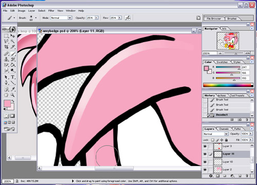
Repeat the process until all your highlights are done. You should be here:
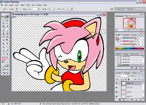
Now, time for the shading. Using your eyedropper, replace your highlight colour with your shading colour. Keep your base colour as the background colour, again to rectify mistakes. Now, using your magic wand and the "Select > Modify> Expand" tools, select the pink areas again. Now using your airbrush, begin to shade on the layer underneath your highlight. Don't worry about the shading seeping into your highlight, as this is why we created seperate shading and highlight layers. For shading, colour using the same method as the highlights, but aim to make it around the same width as your highlight, and more intensive as you get nearer to it. You should get something like this.
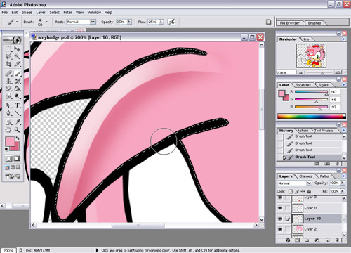
Repeat the process until all your shading is done. If you are completely happy with how it's turned out, a good idea would be to group the three layers together with Ctrl + E. That way it's less layers to worry about. Bear in mind it'll be almost impossible to come back to and edit if you do this though! You should be about here:
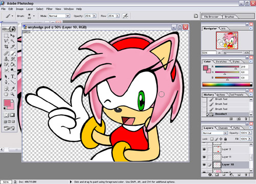
You're pic should be starting to develop a bit of character now. :) Next, for any more non primary colours. Repeat the process as before - in this case, this involves just the skin and the mouth. So colour that in using the same method as the pink, using a lighter colour for highlights, a darker colour for shading, and your base colour for tidying up. You should be about here:
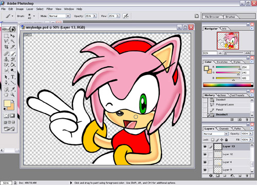
Now, for the unnecessary evil known as the Primary colour. In Sonic Team style, Reds, Blues, Greens, and in the case of Amy's bracelets, yellow, are known to have double colour gradients. And with Amy, you get to do three out of the four. JOY! We'll start with her dress and hairband.
Open up a piece of Amy art, and take a look. As you can see, her hairband and dress have a double colour highlight; the gradient starts at an orangey-red colour, then develops into Yellow. So what we'll do, using the eyedropper, is to grab the brightest yellow part you can find, and the darkest orange-y part you can find as your background and foreground colours. Done that? Now you can fill in the highlights.
Select the area for your highlights as before, again, a step at a time. Now, what we do now is slightly different. Firstly, paint over the highlight as you would normally using your darker colour. Once you've done that, go over it again, this time with your lighter colour. You should get something like this:
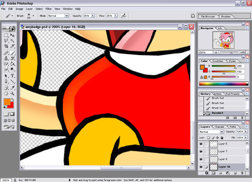
Continue until all your red parts highlighted. Then select the darker colour and shade as normal. You should be about here:
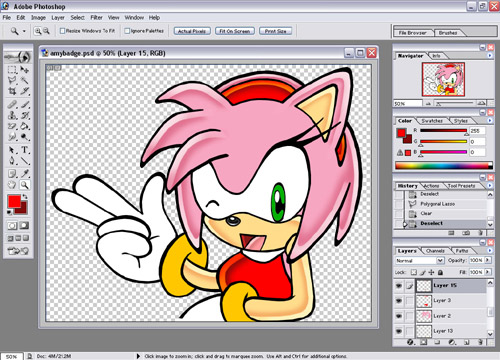
Next up; Amy's bracelets. These are weird as they go against pretty much every rule of the style thus far. This is mainly as the following part is how you go about creating metallic effects. Anyhoo, the highlights are the major difference here, not only being double coloured, but taking up about half of the bracelet in themselves. Right, using ye olde eyedropper, select the two highlight colours that you'll need. The lighter colour being an almost white version of your darker colour.
Now, using your polygonal lasso and the Smooth tool we all know and love, select an area with a similar shape to this:
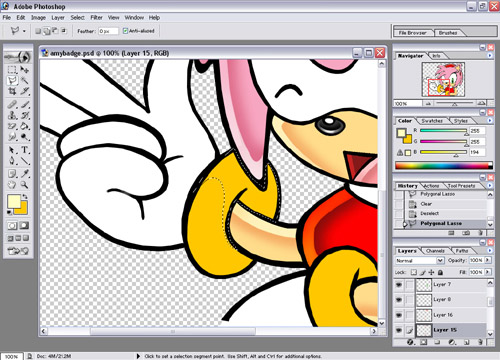
The best way to explain this is just to pretty much show how to shade it, so using your lighter colour, shade so you get something like this:
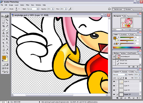
Now, shade the bracelet as you normally would, and repeat the process for the other bracelet. You should be here:
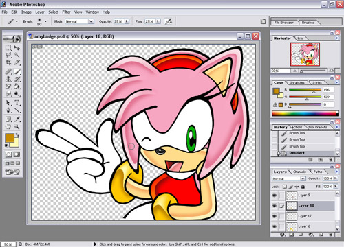
Next, we'll add some definition to the eyes. Using your eyedropper, select the blueish shaded colour from the eyes on your reference pic. Then using your Polygonal Lasso, and the Smooth Modifier, select a small border around the top of the eyes, and fill it in.
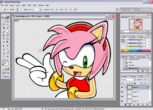
Much better. Now onto the white. This is quite simple as all you have to worry about is the shading. Best way to colour white is to select the areas that you want to shade with the Polygonal Lasso and colour in, like so:
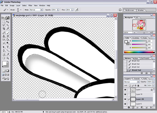
Colour in the rest of the white areas, and you should be about here:
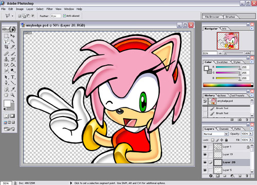
Next up, one of the most annoying parts...the eyes. saving the best till last. Bwahaha. Anyhoo, using your Polygonal Lasso, select the entire right hand side of the eye, from top to bottom. Once you've done that, it's now time to colour it. As you can see, Amy's eyes are green, therefore it's victim to the ol' primary colours rule. The first colour you need to grab is a slightly lighter version of green, and the main highlight, strangely, is a nuclear banana yellow. So shade the highlight as you did with Amy's dress, and you should be here:
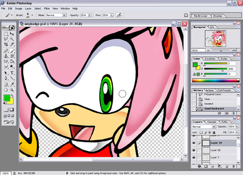
Next up, pick a small brush, and then shade in your shaded colour as normal. You should be here, and you're ALMOST DONE. :) Praise the Lord! Etc Etc!
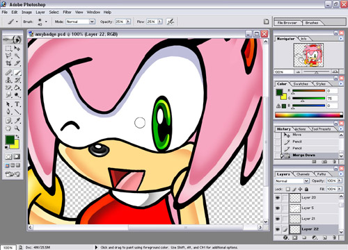
Now, for the very last part. Create one last layer underneath your lineart and convert it's blending option to "Multiply." Next up, select a mid range grey (R: 137 G: 137 B: 137 is my regular one). This is to create the 3D style shading effect, and add an extra dimension to the pic. Now, using your Polygonal Lasso, select the areas you want to shade. Again, it would be a good idea to use some reference pics to get a feel where the shading should go. Fill in the areas with the Fill tool. Now, you can touch up any parts of the pic you missed...and you're done!
