Adding details
Since pixelart often has a lot of detail work, an additional part is devoted to this.
Windows
We'll begin with the details by adding some windows. We use the basic isometric approach again, which is two pixels to the side and one up. Make the basic window frame, as shown zoomed in image 13. Fill the frame with a dark brown color. Use the following values for this, ( RGB: 88, 56, 32) Fill the inside with a light blue ( RGB: 178, 232, 237). Now move this window somewhere in the corner of the big wall. Zoom in at around 800% on the window, and copy the window layer. Move the second window 6 pixels left so it comes next to it. Use the texture lines to align them correctly. Repeat these steps until you have 4 windows in a row on the second floor.
Add one window on the first floor.
Copy the window again, and flip it horizontally. Since the left side of the building is the shady side, the window should be darker. Go to Image " Adjust " Brightness/contrast and reduce the brightness to -20. Place the darkened windows on the shady wall.
Door
Make a door by using the same "method" we used for the window. Use a dark color for the outline. I filled the outline in with a drak grey color. Make the door around 18 pixels high and 8 pixels wide. Copy the door and move them both in place. Copy one again and flip it horizontally and reduce brightness with around 20. Move that one to the shady inlet wall, and remove the top part which would get "blocked" by the upper wall.
Antenna & Tube
Now I added an antenna and tube, to give it that typical industrial look. Just try for yourself whatever looks good. The results are shown in image 15.
Shadows
I always do the shadows at last, because then you actually have all the objects that cast a shadow. Since the roof is so dark, we will not place any shadows there. I always make the shadows with a straight horizontal line, on the shady side. An example is given in Image 16. So basically, the bottom line of the shadow is actually the inner white line but then 90 degrees rotated. The shadow color is black with an opactity of around 30%. The length of the shadows is often only one/third of the height of the object, but since I like to express this method more clearly, I have chosen for a longer shadow ( hey it can be sunset at that time!)
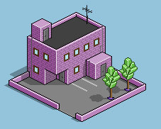
The end result, after applying all the shadows, is seen in image 17. Note that I usually do not restrict myself to one correct way of doing shadows. Basically, if it looks good I use it.
Finishing touches
The building is done, you may go on as long as you like, depending on how detailed you want it to be.
I actually went on a little bit more and added a parking lot with a couple of trees.


