I will try my best to explain how to make isometric buildings. There are many programs one can use for pixelart. The one I use is Photoshop. Be careful only to use non-anti-aliased tools. This tutorial is meant for people who have basic knowledge about pixel art, though. Part 1 - Setting up your work panel
This isnt just for this tutorial. Starting off on the right way can really help you save time and make it easier to do big and/or complex scenes. Get rid of any menu that you dont need. This means everything except the history menu, layers menu and toolbar.
Background
Make a new file with size 300x400. Select transparent background. Because we want to make a grey building, we will be working with a lot of light grey colors. The best thing to do is choose a background color that contrasts the color you use most in your creation. I generally like to work with a green background. So for our convenience, choose RGB 88, 188, 86 as a background color.
Some extra lines
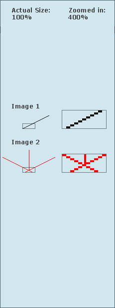
When you make tiles, walls, etc. Its always usefull to have a line somewhere up for grasps. So grap the pencil tool and make a black line as shown on image 1. When youre done, copy it and flip it horizontally (Edit > Transform > Flip Horizontal). Name these layers line 1 and line 2.
Guidelines
Guidelines are especially useful for bigger, more complex scenes. Make a red line in iso style, thus two pixels to the side and one pixel up, you know the drill. If you dont, take image 2 as an example.
After you did this, set the opacity to around 35%. I also like to name this layer, as you frequently need it. You can copy this one and flip it vertically, so you have two different guidelines. They come in handy for transparent objects aswell.
Two views
It can become quite a burden to zoom in, add a few pixels, zoom out to see if it looks good, zoom in to change something again etc. Therefore, its a lot easier to have two views in Photoshop, one with the actual size and one big view for zooming in. Go to view and click new view. Make the width as small as the layer menu. Place it directly above the layer menu on the right or left side of the screen. The other view will be used to zoom in so it needs to be as big as possible. Make sure the scroll bars on the side are still visible. Dont worry about the toolbar, it may overlap. Now you make optimal use of your monitor screen, and you wont be zooming in and out as much.
This is the end of the first part. You havent created anything yet but if you start and make big scenes you will find out that you can save a lot of time this way. There are probably a lot more different ways to set up your starting panel, but this is just how I do it.
|


