by - dxd
This tutorial assumes you know the tools of Photoshop. It's also been tested on Photoshop 7 and Photoshop CS.
Choosing a photo to manipulate
When starting a macabre photo manipulation of a stock photo there are some things you should consider. Size, quality, clarity and pose.
Size: The larger the stock photo, the easier it is to manipulate. I would never manipulate a photo smaller then 900 by 1200 pixels. Why? You can always make an image smaller, but when you try to make it bigger you lose quality and it begins to look ugly very quickly.
Quality: The way a stock photo is lit and the background it has play a big role in your manipulation. A poorly lit stock photo makes it very difficult to get good details. Also a stock photo with a bust background is hard to cover up or remove.
Clarity: You should always choose a nice clear image with as little blur as possible. You can add blur later if you want but it makes the detail work harder if it's blurred to begin with.
These also apply when choosing textures. Poor quality textures mean more work for you and a poor finished product.
Pose: You should choose a pretty neutral pose, you want the attention to be drawn to your manipulation not to the pose of the stock artist.
Preparing the stock photo
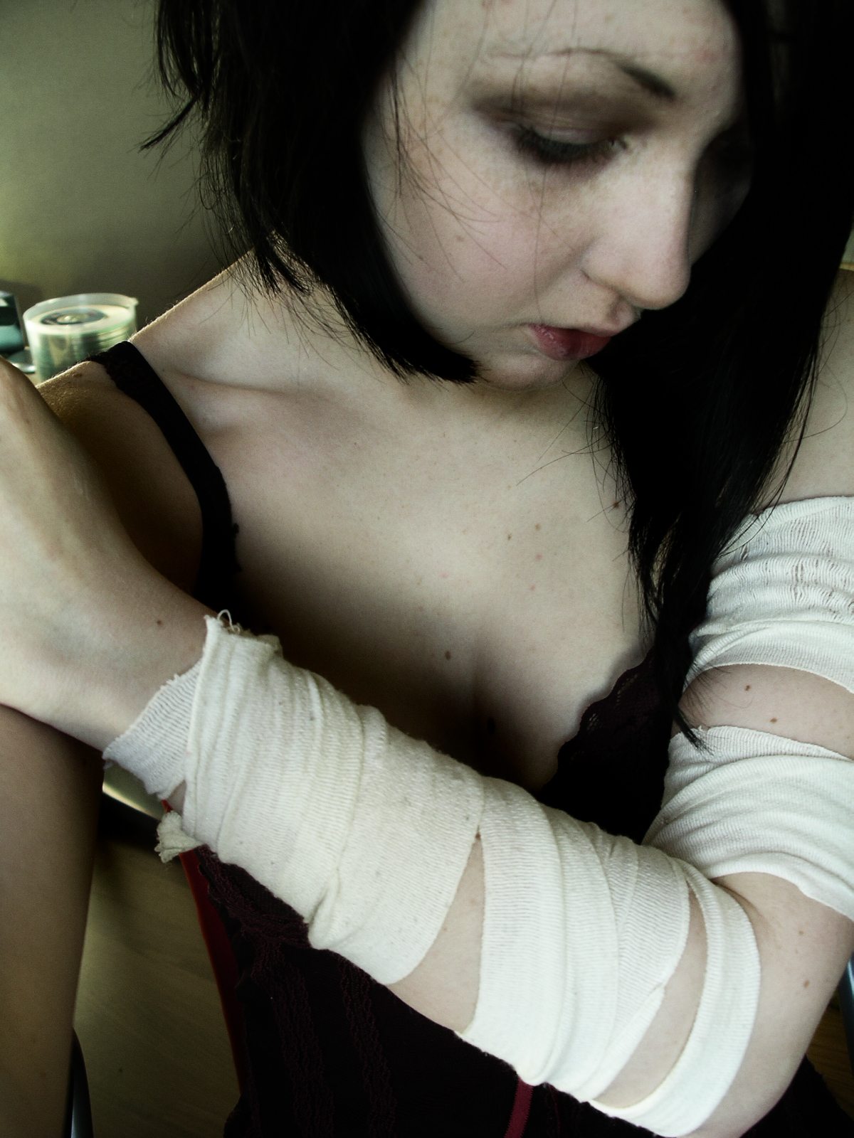
Before you start to put on your textures, you should try to remove spots and blemishes from the skin with the healing tool. It's easier to apply the textures if the skin is smooth and even. Again, you can add these things later if you feel like it.
How to Create Social Change
When applying a texture there are several modes you can choose. Each looks different, so we use each for a different purpose and colour.
With this piece the emphasis isn't on the amount of textures but how well they fit to the image. Most of the time here was spent experimenting and erasing.
PS: Do not recreate my artwork (using this image) and submit it as yours it is only for learning purposes.

I start each picture by adding a border around it so I can work with it, you don't have to add this. Lets darken the eyes using the burn tool. I'll assume you know how to do this, it's one of the basics that most macabre photo-manipulators seem to use. I also added some burning in between the bandages for bruising, you may want to wait before doing this, you'll see why later.
Don't make it too heavy, we need to be able to see some of the eye when you're done.
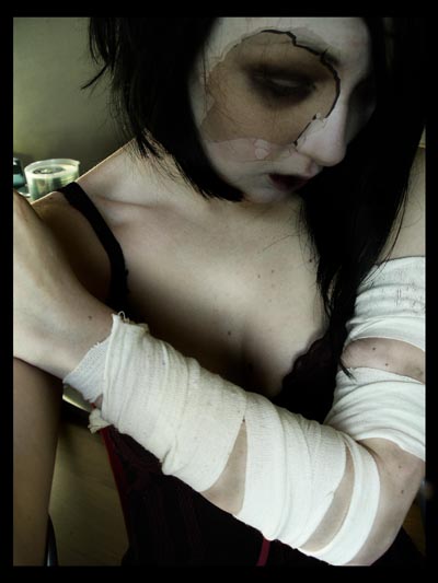
The first layer I added was a texture from my own room. Drag it onto the stock photo and set the mode to multiple. Then move it so that it covers her eye. Select the eraser tool and set it to a medium sized fuzzy brush. Carefully erase around it the hole, leaving about 100 pixel border, this just adds a little darkness to the surrounding skin. You should have something that looks kinda like this when you're done.

Now drag in a cracked texture and set it to overlay. Do you see how it looks thin and unrealistic? Later we're going to duplicate the layer and you should have a much thicker looking texture (it will look like this if you duplicate it now). It's starting to take shape, but now the tedious stuff starts.
Now get your fuzzy eraser again and carefully erase the texture where it's not covering any skin. This includes the bandages, her hair, the background and her clothes. If you don't do this then the end product will look very unprofessional and messy. Remember earlier I added the bruising, it complements the cracks. We're trying to give the impression of self harm/abuse here so it's essential that all clothing is clean from cracks. Ok now you've done that lets sit back and have a look at the features of the person and how they interact with the texture. If you look at the example above you will see that there is a large crack going from her neck to her chin, this is impossible in real life and in art it just looks bad. So we take to the healing brush again and remove it. Alt right click on a suitable place. While we're at it lets check the rest of the piece for similar parts. After you've healed over some of the cracks duplicate the layer and you should have something that looks like this.
Not far to go now.
Create a new layer and using a large soft brush paint the left hand side, with the vertical arm red, the change the layer mode to hue. Now get some grunge brushes and on another new layer paint some white grunge into the top left corner, this is just for a little added interest. Finally drag a yellowed paper texture over the picture and set the mode to overlay.
To imprint the text write the text you want and change the layer style to Outer Bevel and use these settings
Then go to select - load selection and load the selection for your text. Make the first cracks layer the active layer and delete the selection. Do this again for the second cracks layer.
This is how it should look when you're done if you've left the layers in the order that you did them in.
Things to remember about photo manipulation are, only manipulate photos you have permission to use. It's also nice if you tell the stock artist where you used their stock and to leave them a link in the description.
Keep experimenting with different layers and different layer modes. Use the best stock that you can and enjoy yourself.
PS: Do not recreate my artwork (using this image) and submit it as yours it is only for learning purposes.