
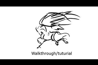
 |
1)
Ah yes, after pushes I've done something that's supposed to remind
of a tutorial, or at least show you
how
I work on a cg image.
This entire image was made from scratch
in Photoshop CS (version 8)
with a wacom tablet. So please enjoy,
it that's possible..:o)
If you have any questions,
you can always e-mail me.
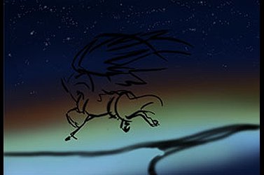 |
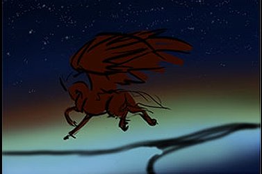 |
layers at this time:
- the horse sketch
- the background
- the stars
- the land sketch
- that which will be the horse later on
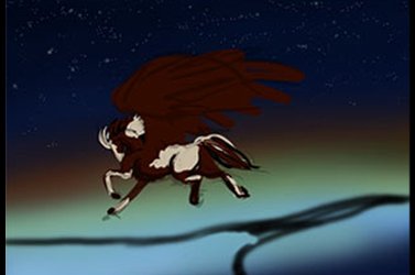 |
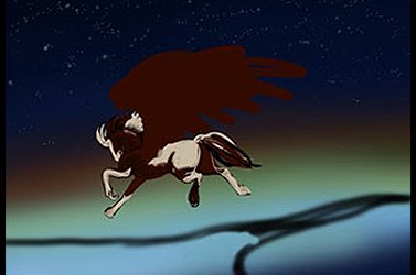 |
and highlighting.
The sketch layer is hidden at this time. I'm leaving the wings be for now, hence they are the hardest part for to do.
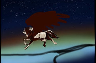 |
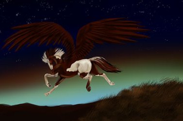
6) Humdidum. More shading. At this time my feelings about the background are starting to change, I don't like it. Also I've started thinking about lightning, and realize that the equine it's much too bright for this dark landscape..
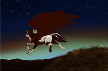 |
sky and darkened the hue. I also started on the far off landscape and
the hill from which the leap goes.
The grass is rough at this time, made with a pencil I created rather quickly.
 |
 |
 |
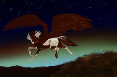
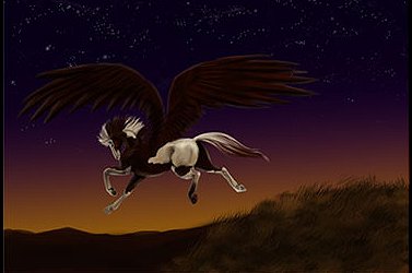
point I worked and reqorked and reworked. Until oblivian it seemed.
Now I also saw that the tail I fixed up at an earlier stage sucks. *sigh*
 |
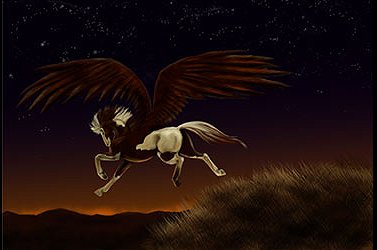 |
suns departure. The hill is being
further worked on, and the horse get some yellow tinting to fit the light. Highlights in orange are added in a separet layer, to see if it fits, and it does. Somewhere along the road, I've worked more on the stars, but I don't recall when. Also the wings get a beating.
 |
"Mia" Marie Michaela Bengtsson aka Losmios
http://www.citytryck.com/mia/