
by - Tiku
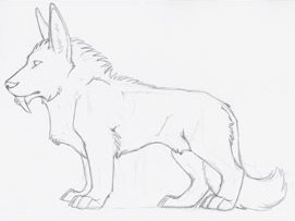
Step one: Make a sketch. It really doesn't matter how big or small it is, large enough for you towork with it. This is all relative.
Step two: Ink your sketch. Again, this is all relative. Ink the lines you'll need when making your pose. TIP: I've found making a bolder outside line makes it easier to have a nice crisp outline on your pose later.
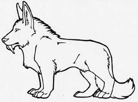
Step three: scan into photoshop. Now is when things get slightly complicated. Make sure that your sketch is at 150 ppi (pixels per inch). You can find this by going to image -> image size. Its often easier to scan your artwork at 150 ppi to begin with.

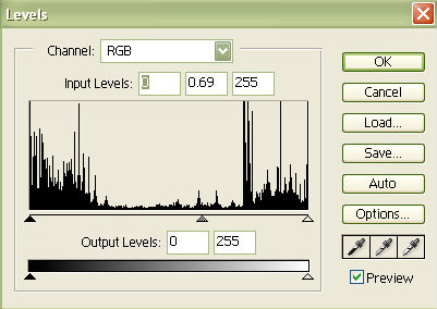
Now go into your levels pallet (image -> adjustments -> levels.) Here you want to play with the levels by adjusting the three tabs on the bottom and clean up your line art. The goal is to make the whites whiter first, by taking the middle tab and move it to the left. Make sure you have the preview button checked. Don't make your line art TOO bright, as you won't be able to work with it well. (TIP: Ctrl-z for an easy undo command.) After you clean up the white, click ok and go back into levels pallet again. Now move the center tab to the right to make the black line art darker. Now that its good and black, click OK.
Now that we have nice, clean line art - open your layer pallet. (View -> layers.) Click on the layer marker "untitled" and duplicate it. (layer -> duplicate layer) Now drag the "original" layer to the little trash icon in the bottom of the pallet. It was a locked layer and we can't use it.:)
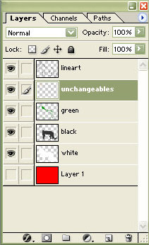
Now that we have the line art layer, you want to make one layer for every color on your character. I made five extra layers. Make sure that one is all red (or any other color so long as it is NOT in your pose) and it should be named "background". (To name a layer double click on its name.)
Once you have all the layers you need, click on the "lineart" layer to make sure you're working on that layer. (Two ways to know if you're working on a layer. 1: its highlighted and 2: there is a little paint brush in the second square on the layer)
Now we are going to make the line art one, solid black line. Click on the eraser tool and hold until you find the hidden "magic eraser tool". Click on this tool and make sure none of the top boxes are checkd. Now click anywhere on the white and it should all disappear.
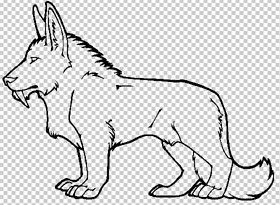
Now use the magnifying glass and center in on a piece of line art and click away all the brightly colored pixels. Now zoom out. You should have alot of dark grey and completely black pixels. Go now to the levels pallet and move the center tab all the way to the right. You now have crisp line art which allows you to see straight through to all of your layers. (The layer that is all one color allows you to see the bright pixels or stray pixels and clean them up easier.) You line art should look like the picture below ( this particular one has the solid colored layer turned off.)
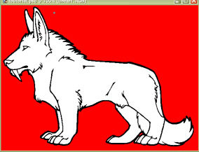
Once you have nothing but line art, click on the first layer of color that will be in your pose. Color in the entire pose to that one color. It should look something similar (the colors will vary) to the picture on the right. Now, from here - move on to block in each color where it belongs on your pose, making sure each color is on its own layer. This will come in handy later on when you're shading. The final result of your color blocking should look as below.
NOTE: When blocking in colors for your pose. I would recommend using WEB ONLY COLORS. You can get these by clicking the tab on the bottom of the color picker. (get the color picker by double clicking on the color tiles on the main tool pallet.) This way, when your pose is compressed into a .gif it won't murder the work you've done by using the best guess. Working in just 256 colors isn't as bad as it sounds. :) It makes it worth it in the final result.
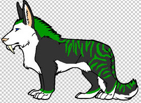
Now we come to the fun part! Shading ! (In my opinion, this is actually the easiest bit of the post making.) Now, personally, I cheat. When it comes to shading I use the dodge and burn tool.
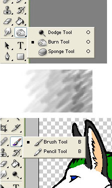
They're fairly straight forward. Burn will shade the color where as dodge will create a highlight. I would suggest not using them at full strength, adjusting their saturation to somewhere between 50-60%
Tips on color black: When you color black, I would suggest using the darkest grey instead of a straight black. (Hexcode: 333333) This way you can use dodge and burn on it like you could any other color. Once you've shaded and highlighted, it will look very grey. Make sure you're working on the black level and go to you levels pallet (image -> adjustments -> levels) And move the center tab to the right to get a nice, dark black but maintain your shades and highlights.
Tips on coloring white: Alot of people seem to have their own little tips and tricks or ways around shading white. White is a pain in the ass, but quite do-able. When you're in web-only colors, work from the lightest grey to the darkest grey, and use the brush tool to add in the shading. Layer each color one on top of another until you get your desired shading. White will never need highlights as it is its own highlights. Your only concern should be adding in darks.
When you're done with your shading, your final product should look something like below.
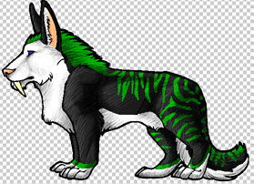
Okay, now that we have a completely shaded piece, the real entertainment begins. First of all:
SAVE YOUR PROGRESS. By saving a .psd file at this stage in the game, it will allow you to go back to the original and make any changes easier. Now, go to the image size pallet (image -> image size) and change the resolution to 72 ppi. Click OK. Yes, I know it looks like crap now. Go back to the image size pallet and now go up to the width / height pixel dimensions and change the largest number to whatever it acceptable for your chat room.( in this case, I made the length 200 pixels.) Click OK. Yes, now I know it looks -worse-, Don't kill me just yet.
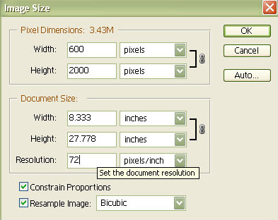
Now, change the mode of the image to "index color". (image -> mode -> index.) Make sure your solid color layer is turned off before you do this, and when the dialog box appears (merge visable and discard hidden layers?) Click yes. This changes the image to a .gif and gives it a transparent background automatically.
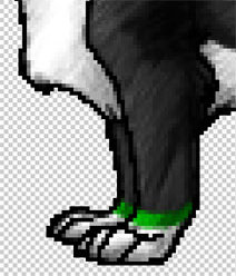
All of the little white and clear dots should have mostly disappeared. But it doesn't look quite right just yet. Go to the hightest magnifaction (or whatever you'll be able to see the pixels better) and go on a full fledged pixel hunt using your pencil tool with a 1px radius. Go around all the pose and make sure you don't have any stray pixels on the outline, and I would suggest going back over all the contour lines within the pose itself.
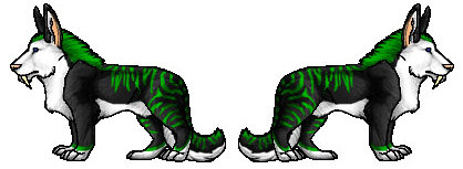
Now that thats done - press ctrl-0 and now you're at full size. And ...we're done! Save your image seperately as a .gif and you've got yourself a completed pose. To get the pose to face another direction, go to image -> rotate canvas -> flip horizontal. This will give you the two pieces.
Tiku